Keep up to date on current trends and technologies
Blog

Best Ahrefs Alternatives Guide: 10 Tools To Choose From
SitePoint Sponsors

The Developer’s Shortcut To Your Udemy-like Platform
SitePoint Sponsors

Best Crypto Payment Gateway for High Risk
NOWPayments
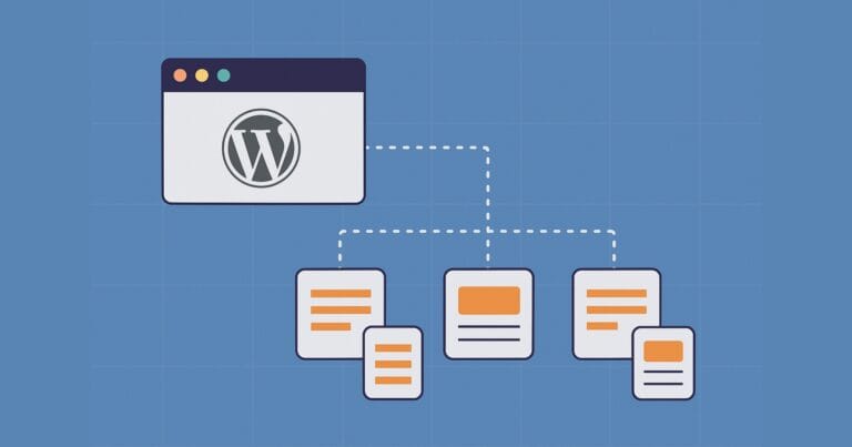
Why WordPress Scalability Starts with Smart Site Structure from Day One
Fred Morpeth

How to Build Scalable Web Apps with React JS
Dejan Popović

Best Crypto Payments Gateways in 2025
NOWPayments

The Ampere Porting Advisor Tutorial
Dave Neary
The Basics of Node.js Streams
Sandeep Panda

Why Your Automation Needs AI Decision-Making (And How Wordware Delivers)
SitePoint Sponsors

CNCF Triggers a Platform Parity Breakthrough for Arm64 and x86
Scott M. Fulton, III

How AI is Changing Motion Design (And What It Can’t Do Yet)
SitePoint Sponsors

Benefits of Custom Telecommunication Software
SitePoint Sponsors
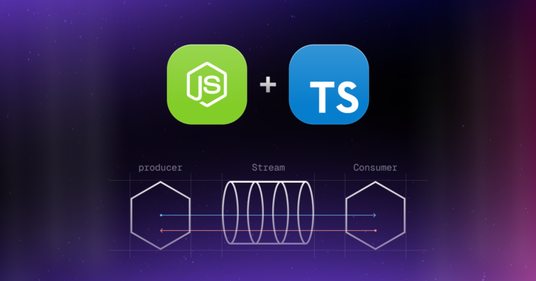
Node.js Streams with TypeScript
Raju Dandigam

5+ WordPress Plugins for Developers To Use in 2025
SitePoint Sponsors

Top 21 Developer Newsletters to Subscribe To in 2025
Anna Hrechka
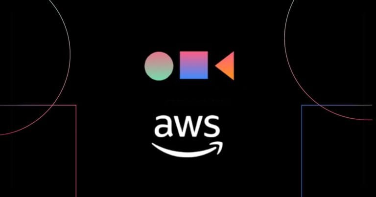
Serverless Image Processing Pipeline with AWS ECS and Lambda
Raju Dandigam

How To Begin A WordPress Blog: A Step-By-Step Guide For Beginners
SitePoint Sponsors

Top 9 WordPress Themes To Use in 2025
SitePoint Sponsors

CNCF Arm64 Pilot: Impact and Insights
Craig Hardy
How to Build a Multi-Tenant SaaS Application with Next.js (Frontend Integration)
Juliet Ofoegbu
Building a Multi-Tenant SaaS Application with Next.js (Backend Integration)
Juliet Ofoegbu

Why Spreadsheets Need Better Coding Support
Quadratic AI

Building a Network Vulnerability Scanner with Go
Rez Moss

14 Best SEO Tools for Agencies to Boost Client Results in 2025
SitePoint Sponsors

The Best Free Backlink Checker Tools: Overview and Comparison
SitePoint Sponsors

The 10+ Best AI & Pro Web Design Tools for 2025
SitePoint Sponsors
Making a Browser Based Game With Vanilla JS and CSS
Eoin McGrath

Prompt Engineering for Web Development
Kevin Leary
10 Best AI Code Review Tools and How They Work
Anna Hrechka

AI-Assisted Coding for iOS Development: CursorAI and Upcoming Swift Assist
Prithiv Dev Devendran
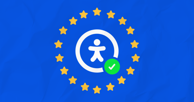
Meeting European Accessibility Act (EAA) Standards: A Developer’s Checklist
Ran Ronen

10 Common Web Development Mistakes to Avoid Right Now
James Fox
Showing 32 of 7918