Keep up to date on current trends and technologies
Blog

Understanding Memory Page Sizes on Arm64
Dave Neary

Don’t Choose the Wrong Web Team — Here’s Why It Matters
Jerry Zhang

Gemini in Google Workspace: Your New AI-Powered Collaborator
SitePoint Sponsors

Droip Review: Why You Should Choose Droip Over Traditional WordPress Page Builders in 2025
SitePoint Sponsors

5 Best Payment Gateways for SaaS: Your Ultimate Guide
SitePoint Sponsors

Unleashing the Power of ArgoCD by Streamlining Kubernetes Deployments
Raju Dandigam

How OpenTelemetry Improved Its Code Integrity for Arm64 by Working With Ampere
Scott M. Fulton, III

Red Flags in Social Media: How Developers Can Benefit From Online Behavior Analysis
SitePoint Sponsors

Cost Effective Reseller Platforms for Buying SSL Certificates
SitePoint Sponsors

Angular Signals: A New Mental Model for Reactivity, Not Just a New API
Sonu Kapoor

Best Semrush Alternatives (2025 Edition)
SitePoint Sponsors

Best Ahrefs Alternatives Guide: 10 Tools To Choose From
SitePoint Sponsors

The Developer’s Shortcut To Your Udemy-like Platform
SitePoint Sponsors

Best Crypto Payment Gateway for High Risk
NOWPayments
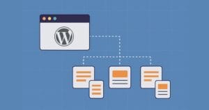
Why WordPress Scalability Starts with Smart Site Structure from Day One
Fred Morpeth

How to Build Scalable Web Apps with React JS
Dejan Popović

Best Crypto Payments Gateways in 2025
NOWPayments

The Ampere Porting Advisor Tutorial
Dave Neary
The Basics of Node.js Streams
Sandeep Panda

Why Your Automation Needs AI Decision-Making (And How Wordware Delivers)
SitePoint Sponsors

CNCF Triggers a Platform Parity Breakthrough for Arm64 and x86
Scott M. Fulton, III

How AI is Changing Motion Design (And What It Can’t Do Yet)
SitePoint Sponsors

Benefits of Custom Telecommunication Software
SitePoint Sponsors
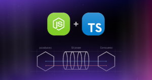
Node.js Streams with TypeScript
Raju Dandigam

5+ WordPress Plugins for Developers To Use in 2025
SitePoint Sponsors

Top 21 Developer Newsletters to Subscribe To in 2025
Anna Hrechka

Serverless Image Processing Pipeline with AWS ECS and Lambda
Raju Dandigam

How To Begin A WordPress Blog: A Step-By-Step Guide For Beginners
SitePoint Sponsors

Top 9 WordPress Themes To Use in 2025
SitePoint Sponsors

CNCF Arm64 Pilot: Impact and Insights
Craig Hardy

How to Build a Multi-Tenant SaaS Application with Next.js (Frontend Integration)
Juliet Ofoegbu

Building a Multi-Tenant SaaS Application with Next.js (Backend Integration)
Juliet Ofoegbu
Showing 32 of 7930