Keep up to date on current trends and technologies
Blog

Building a Network Vulnerability Scanner with Go
Rez Moss

14 Best SEO Tools for Agencies to Boost Client Results in 2025
SitePoint Sponsors

The Best Free Backlink Checker Tools: Overview and Comparison
SitePoint Sponsors

The 10+ Best AI & Pro Web Design Tools for 2025
SitePoint Sponsors

Making a Browser Based Game With Vanilla JS and CSS
Eoin McGrath

Prompt Engineering for Web Development
Kevin Leary

10 Best AI Code Review Tools and How They Work
Anna Hrechka

AI-Assisted Coding for iOS Development: CursorAI and Upcoming Swift Assist
Prithiv Dev Devendran

Meeting European Accessibility Act (EAA) Standards: A Developer’s Checklist
Ran Ronen

10 Common Web Development Mistakes to Avoid Right Now
James Fox

Best Payment Gateways in France for 2025
NOWPayments

Random Forest Algorithm in Machine Learning
SitePoint Team

What Is Cloud Computing?
Dianne Pena
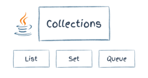
Collections in Java
SitePoint Team

ZEISS Demonstrates the Power of Scalable Workflows with Ampere Altra and SpinKube
Scott M. Fulton, III
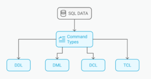
SQL Commands: The List of Basic SQL Language Commands
Dianne Pena
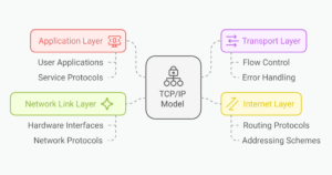
What is TCP/IP Model and How Does The Protocol Work
Dianne Pena
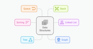
Data Structures and Algorithms (DSA): A Complete Tutorial
Dianne Pena

A beginner’s guide to Retrieval-Augmented Generation (RAG)
Komninos Chatzipapas

Control Statements in C: A Comprehensive Guide
Surabhi Saxena

How Game Developers Detect and Prevent Modding and Scripting
SitePoint Sponsors

How to Conduct Accessibility Testing with Screen Readers
Ran Ronen

How Amazon Q is emerging as no-code serverless Gen AI virtual assistant
Suvoraj Biswas

How to Apply CSS3 Transforms to Background Images
Craig Buckler

How to Set Up Basic jQuery Form Validation in Two Minutes
Maria Antonietta Perna

Bootstrap Card Component: a Complete Introduction
Ahmed Bouchefra

How to Set Up the New Google Auth in a React and Express App
Onuorah Bonaventure Chukwudi

How To Use jQuery’s Ajax() Function for Asynchronous HTTP Requests
Aurelio De RosaMaria Antonietta Perna

Best AI Programming Languages
Lucero del Alba

Best Programming Languages for Game Development
Lucero del Alba

How to Send Email with Django Using SMTP Server
Daniel Diaz
How to Use JSON Data Fields in MySQL Databases
Craig Buckler
Showing 32 of 7899